
 Q & A with book designer Tamara Dever of TLC Graphics
about the art of book covers
Book covers are the first impression most potential readers see when browsing the racks at the local bookstore. Even online shoppers see the cover. So, have designers changed how they create a cover when 40% of books are bought with thumbnail images? We asked WPN board member and graphic artist Tamara Dever her thoughts about the evolution of book cover design in the digital age. Interviewer: Kate Sexton Kaiser
Q: Do you see any new trends in the design of book covers or book promotional pieces?
A: While we don’t tend to follow trends too much (in favor of good design), we do love some of what’s popped up this year. You’ll see the use of a lot of great handwriting typefaces, the chalkboard look, the retro logo look, and the flat icon style. I do like the idea of going back to a pre-digital look and several of these styles lend a warm, friendly feeling to the book. Trends can work, but only if that design is truly the best way to augment the message of what’s written inside.
Q: What are the primary elements of a book that inspires your covers?
A: The author’s passion is always number one. That fuels our passion for each project. We begin by talking with the author/publisher about their audience and goals, then follow up with a questionnaire that asks about the readers’ demographics, the book’s competition, and other pertinent details. Of course, the title and subtitle spark a lot of the design choices we make. In novels, often one incident, character, or scene will drive a cover’s design. Our goal is to marry salability and marketability with adoration from the author. If the author doesn’t love their cover, it can squelch their enthusiasm and that can hinder sales. Think of how you feel when you have pimples on your face — a little less bold and somewhat embarrassed!
Q: Has your designing changed now that over 40% of books are bought online where only a small thumbnail of the cover is visible?
A: Some designers advocate using extremely large type and simplified designs because so many books are sold online now. I understand that, however, when viewing a book’s cover online, it doesn’t have to be a huge title that makes it pop from the screen. An intriguing image, layout, or color combination can attract your attention properly and the book’s title nearly always appears near the cover, often with a description as well. Because of this, I think the online thumbnail actually has an easier job than the book found in a brick and mortar store.
Q: Please share with us examples and what attracted you to the cover and what stands out as good design.
A: Publishers produce so many great book designs every day and we love to ogle them, draw inspiration from them. Once in a while we even amaze ourselves. (I mean that very humbly!) Below are a few from both others and our own portfolio that we love.
Books from outside of TLC Graphics:
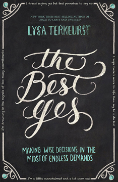 The Best Yes by Lysa Terkeurst: This is one of my absolute favorites this year. It took my breath away the instant I saw it. The handwritten title on a chalkboard is perfect for the subject matter and audience. The limited color palette is striking yet soothing, and the placement of key phrases within the border makes me smile.
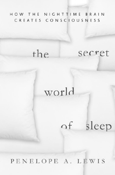 The Secret World of Sleep by Penelope A. Lewis: This is a genius solution for a book on sleep. The integration of the text into the photo, simple typography, and monochromatic colors become bold because of their striking simplicity.
Books from TLC Graphics:
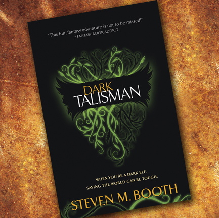 Dark Talisman by Steven Booth is one of my favorite designs from our portfolio and a national award-winning cover. It’s simple yet represents the underlying story line through its imagery. The physical book is a hardcover using green foil, embossing, and a beautiful and subtle use of matte and gloss finishes to add to the design. Even the case cover (beneath the jacket) has a unique design to it.
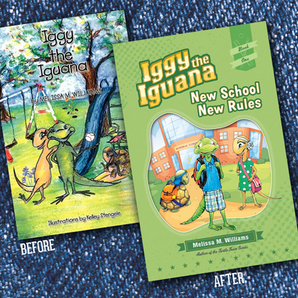 Iggy the Iguana Series by Melissa Williams: The Iggy series is from one of our long-time clients who published it as her first book, long before we met. She’s now ready to upgrade the series for preteen kids and we’re having a blast with it; redesigns are always fun. Sometimes the “before” comes about because of a small budget or having used a novice designer but other times the book has simply had a long shelf life and needs to be updated for today’s market.
 Israel for the Christian Traveler by Joan Peace: The combination of a stunning photo, complementary color palette, and simple title treatment with character make this one of our internal favorites as well. It’s a hardcover that has an elastic band built into the back cover to be stretched over the front, keeping it closed while traveling. This is also a makeover, but it was redesigned before the original had gone to press, saving the author some money and potential heartache.
Q: Is anything changing with how the interior pages of a book is laid out?
A: Not much has changed about classic typesetting. We do emphasize branding that continues from the cover throughout the interior, even in novels. Some publishers skimp on a book’s interior layout, doing no favors to themselves or their authors. While the cover gets initial attention and sets the tone of the book, it’s actually the interior that drives the final sale. If it’s not inviting, easy to read and follow, you could easily lose the sale. Our emphasis is always a combination of readability and beautiful design that reflects the design of the book’s cover. Choosing the right combination of typefaces, a readable type size and corresponding leading, and the proper margins are the core to a good interior design.
Q: Any other comments about design you’d like to share?
A: Distributors, reviewers, and even readers form an initial opinion about the credibility of the author and quality of his or her writing from the cover design and the interior layout. Reviewers are inundated with books, and the first thing they do is look at the cover. If it’s poorly done, they most often put that book in the reject pile immediately. The second round is affected by the book’s interior design. They’re looking for ways to weed out books, because they can never get through all of them. So, design often determines whether you get reviewed. It’s like going for a job interview. If you don’t present yourself in a professional manner, you won’t be taken seriously. I tell people, “If you don’t care enough to present your book well, why should others assume that it’s written well and worth their time?”
If you are considering a new book designer, you may contact Tamara Dever at: tamara@tlcgraphics.com
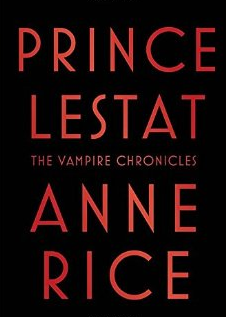 This is Kate Sexton Kaiser‘s choice for best cover of the year – clear and easy to read, in an orange red, the color that attracts the eye first and pops off a bookshelf. With a well-known author like Anne Rice, you need nothing else. Simplicity often delivers a stronger message.