
 by Bernadette Kazmarski
Patricia Fry is writing so fast that I illustrated and designed two covers at almost the same time— PAWtners in Crime and PAWSitiviely Sinister (soon to be published).
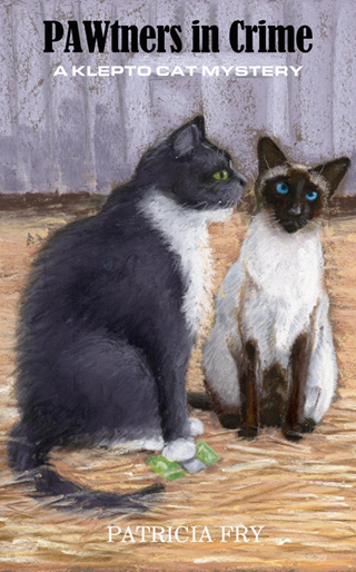
Patricia wanted to introduce KoKo on the cover of PAWtners, so we have Rags whispering in KoKo’s ear while he holds a money clip under his paw. They are on a farm so you see straw underfoot and a red barn in the background. For the Siamese cat model, who else would I choose but Cranberry? Her seal point elegant and bright blue eyes were purr-fect for the part. I heard she might appear in future books—I have plenty of photos of her and can take more.
After I put the cover design together, I decided it needed a little pick-me-up. I had the barn gray instead of white because large white areas in the background tend to fall away and lose detail and look like a blank spot. Gray would help define the two cats with their light and dark areas. I liked the white/gray barn and I liked the illustration, but it just looked dull. All the colors were in the same range, neutral earth tones, but Patricia and I like more colorful covers.
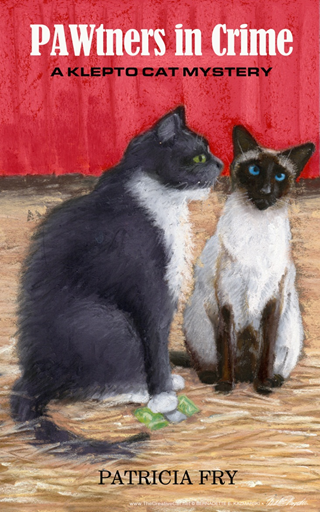 I wanted to send the idea to Patricia, although we had considered the sketch completed. I didn’t want to add red to my original drawing and I certainly didn’t want to draw it over again. I took a convenient shortcut: made a copy of the sketch in Photoshop and added a layer to make a red barn, and sent both ideas to Patricia. She considered the choice and decided on the red version.
The cover for PAWsitively Sinister was a totally different story. The mystery continues as Rags and KoKo are at a mansion and there’s an estate sale. The house is full of interesting pieces of old furniture and accessories. Patricia suggested the two cats could sit together and hold pieces of jewelry. A pocket watch played a part in the story. A Persian carpet really added to the scene.
Where else would I turn for a house full of antiques but to my friend and customer Judi Stadler of Carnegie Antiques? In 2008 when Judi was phasing out of her full-time job and launching her real estate and estate sale career, I took a series of photos of her Victorian home to show her skill in and love of collecting vintage items. I knew the photo right away and could hardly flip through folders on my computer fast enough to find it. I used Judi’s living room as the background.
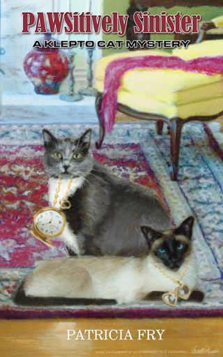 I photographed a locket I found at a yard sale, though I made it much bigger for the illustration. A black-and-white photo of a pocket watch I’d had from years before for another cover illustration with added gold tones worked for the second piece.
The cover is tall and narrow, so having the two cats sit or stand next to each other would resemble other book covers in the series. I looked through other photos of Cranberry. Though I originally wanted one where she was crouching with her elbows in the air, I found this one and envisioned Rags sitting behind her.
The background is busy, so I decided these two positions, from the side, would be best to show them and their bling. Cranberry’s wearing the locket and Rags is holding the watch fob in his mouth so both pieces of jewelry dangle and glitter. I used Photoshop to make a composite that I could draw from.
I don’t use paper for most of these illustrations, but chose Ampersand brand Pastelbord, which is a piece of Masonite with a very fine clay and marble-dust coating that has very little texture. It holds layers of pastel so I can do my finger-painting thing with blending softer pastels and also sketch with harder pastels and pastel pencils. It stands up well to multiple changes. I began the painting with soft pastels to cover major areas with layers of color. I finished the details and edges with pastel pencils.
For PAWSitively Sinister, with all that detail, I used a self-prepared paper with a very fine surface texture and not entirely opaque. I could put it on my light table and trace the details in place and even draw on the light table with pastel pencils. These illustrations are 8″ x 10″ and the books are 5″ x 8″. When the illustration is reduced in size it’s easy to lose details, so I can’t go too big, but getting all the details just right on an illustration like this interior with cats can be tricky when it’s this small. The risk with this paper is that the surface is delicate and drawing too hard will remove the roughened texture and I’d have a hole in my drawing! It’s great fun to take my Photoshop composite and turn it into a painting.
We also designed a two-sided bookmark that includes four books, which Patricia can hand out at book signings and book shows.
Are you interested in illustrations or a book cover or book design? Please contact Bernadette@bernadette-k.com. All images used are copyrighted to Bernadette E. Kazmarski unless otherwise noted and may not be used without written permission.